Color Theory: What Is The Right Color For Your Brand
Do you find yourself gravitating towards certain products or services for not so obvious reasons? Have you found yourself reaching for a product recently purely because you find the way the brand use of colors to be appealing? If you have, then you have experienced color Psychology at work. Most of the time it is subconscious as colors have some influence on your brain in the decision-making process and they play an important role in the way you interpret images, logos, or products.
 Colors affect memories and we often associate some colors with experiences which you can use to influence your clients and customers decision to work with your brand or purchase one of your products or services. Colors have a strong influence on feelings and emotions and studies have shown that people are most likely to remember colors over words or objects which is why many brands are able to use colors to their advantage by leveraging the effect colors have on emotions, memories, and the feelings of their target audience.
If you are designing a logo or trying to decide what colors to use for your brand and all accompanying paraphernalia and you want to know what colors would work well with your brand, pass a powerful message across about your product or service and influence your audience positively, then this post is perfect for you. We have rounded up a few colors, what our brains associate them with, how they can influence consumers as well as some notable brands that use these colors.
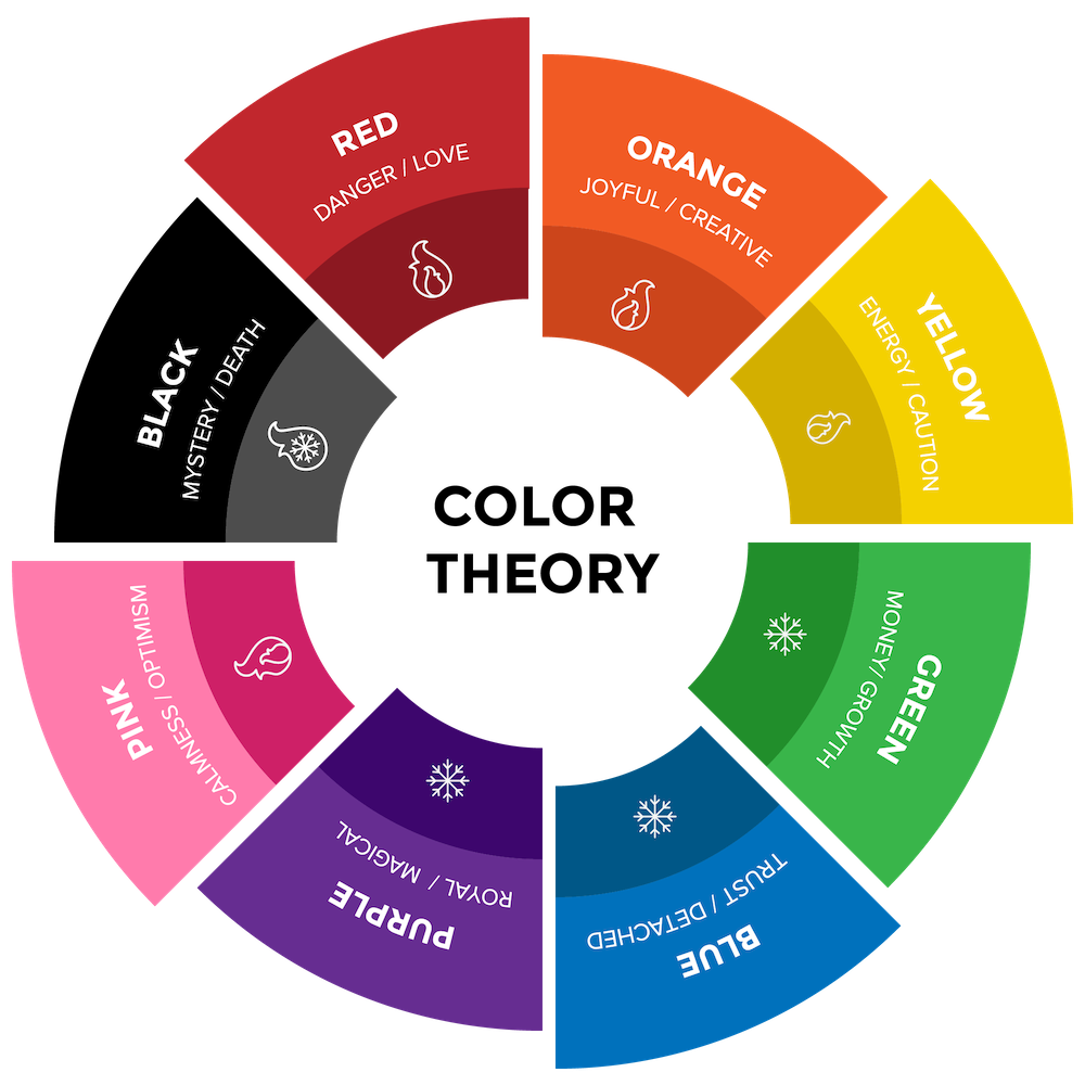
Black
Black is seen as a solid sophisticated color that exudes elegance and class. Recall how you feel when you see someone dressed in a black suit or when you pull up in a black limousine, Black is seen as a serious and powerful color and high-end brands use the color to exhibit their luxurious and high society brands.
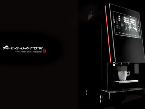
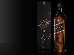
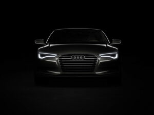
Black often makes people more efficient and tends to make you more aggressive because people associate black with evil. When used in clothing, it makes you look slimmer and seem more fashionable and sophisticated. It is a great background for other colors to pop however it can overthrow other colors too. Using black as your brands’ colors can add an authoritative air to your brand and make people take you more seriously. Brands that use black include, Chanel, Puma and Sony.
Red
Red is one color that is most associated with danger. It could be as a form of conditioning from birth as we always use red to connote danger and so the brain comes to associate the color with pain. However, studies have shown that the color red increases arousal, increases blood flow, accelerated heartbeats and makes one more attracted to things in red wrappings, this could be one of the reasons why red is such a popular color around Valentine’s Day.
Red also makes people more attractive and holds your audience’s attention in a vice grip. This intense color is associated with hunger, speed, confidence, and passion. Red is known to increase the attractiveness of women which is why a lot of waitresses wear red or women in red lipstick seem 10 times more attractive than those with no lipstick on. The color red also makes your reactions intense and can be used to intimidate your competition. Notable brands that use red include Chick-fil-A, Coca-Cola and CNN.
Orange
Most charities, not for profits and generally businesses that require giving tend to use the color orange as their brand colors because color orange sparks feelings of cheer, friendliness, enthusiasm, and warm-heartedness. The color orange is associated with high morals and values and makes you believe a brand which uses orange will offer you high-quality products at low costs. Orange is slightly associated with alertness and danger as well but more in a way of warning which may be why traffic lights have orange in them and emergency officials wear orange jackets to help them stand out or be spotted easily in case someone needs help.

Orange makes you feel cozy and welcome thus giving way for more social interactions and makes your muscles feel much more relaxed. The feeling of warmth associated with orange probably has to do with the sun and the bright glare and warmth its reflection brings. Notable brands that use orange include The Home Depot, Nickelodeon, and Amazon.
Yellow
Yellow is a notoriously happy color, it is associated with joy, cheerfulness, and friendliness. Yellow inspires creativity and self-esteem, helps us make decisions faster and it is also believed to be one of the strongest colors that is most often noticed before other colors and it also forms the base of secondary colors. Because yellow is most associated with happiness, it is associated with brands that are comedic, and brands that inspire optimism and hope. So the next time you rush out with glee on a bright sunny day and reach for your yellow hat or yellow sundress, reflect on how it could be because the color yellow brings out your youthful side and makes you feel more happy and carefree. Brands which use the color yellow include, Best Buy, McDonald’s and Snapchat.
Green
Green is the color associated with nature, health, growth, and everything fresh. Green inspires calm and a feeling of being one with nature which is why brands associated with health and outdoor activities like camping and organic food industries like farmers and health food restaurants tend to use green a lot in their logos. Seeing the color green makes us think of quality and makes a strong statement in industries that often seem impersonal. Green triggers that part of your brain that increases creativity, higher thinking as well as focused and calm actions. Because we associate green with growth, progress, and productivity, you tend to work harder when you are surrounded by the color green so it would be nice to have leafy decorative plants in an office or use green in your brands colors to help make your team and clients feel like they are growing and becoming more productive. Brands who use green include Whole Foods, Starbucks, and John Deere.
Blue
Using the color blue as your brands color seems to be everywhere, from social media platforms to banks and hospitals, every brand seems to want to have a piece of blue colored pie and it is all for good reason. The color blue makes people feel like they can depend on you, inspires trust, coolness, communication, and intelligence.

Blue is believed to lower blood pressure, and make people feel calm and relaxed especially in situations where they would be tense for example lots of hospitals paint their walls blue and medical personnel wear blue scrubs to help calm the patients and gain their trust. The color blue also makes us feel at peace and helps you have clearer thoughts thus making you twice as productive. Brands that use the color blue include, Twitter, Facebook, and PayPal.
Purple
Have you noticed in most movies or storybooks the wise old man or wizard is usually wearing a purple robe or a king sits on his throne in regal purple silk? This is because the color purple is associated with royalty, wisdom, Magic, and curiosity. Purple is perfect for drawing in people who are attracted to the luxurious lifestyle and is also believed to make an impact on an indecisive audience as it is a mix of hot and cool colors and the color Purple helps indecisive people decide what to do quicker.
Purple is a mixture of two colors on opposite ends of the spectrum, red and blue and as such it can have contrasting effects on people. It is not used as often as other colors in branding but this also makes it stand out due to how rarely it is used by brands. Because it is associated with wisdom, schools and search engines tend to adopt the color purple in the brand colors. Examples of brands who use purple include, Wonka, Hallmark and Yahoo!.
Pink
When we see the color pink, we immediately picture a soft, feminine and compassionate brand, this is because for as long as you can remember, you have probably associated pink with unconditional love, and hope. If your brand uses the color Pink, it would prompt a feeling of respect and compliments from clients, and whoever sees your logo or brand paraphernalia anywhere.
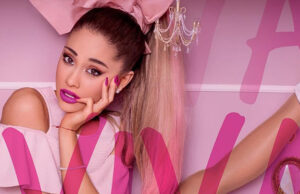
Although pink has been associated with females and baby girls for a long time, recently it has gained popularity with both sexes so you don’t need to worry about attracting only female clients. The color pink has a calming effect on the mind that makes people less aggressive and decreases restlessness. Pink has been known to instantly calm troubled minds and is used in places like nurseries, they use the color pink to calm the kids and keep temper tantrums at bay. Brands that use the color pink include, Sweet Hut Bakery and Cafe, PINK and Puff & Petals.
Gray
Gray might seem drab to some people and you may shy away from using this calming and neutral cool color for your brand but you would be missing out as gray tones work very well with other colors and represent balance. Gray comes in a variety of shades you can pick from to best represent your brands’ image while showing off the other colors you use. It is popularly used in script on a brands logo which helps give logos a clean look. Grey looks especially good when offset against white backgrounds and gives off a cool vibe. Examples of brands that use Gray include Apple, Cobbler Union, and West Elm.
Conclusion
Color plays a big role in how your brand is perceived and interacted with, however, these explanations of colors and what they are associated with are not completely black and white (no pun intended). You can play with different colors until you find the perfect combination that you feel truly represents your brand and the feelings you want to evoke in the minds of your audience.